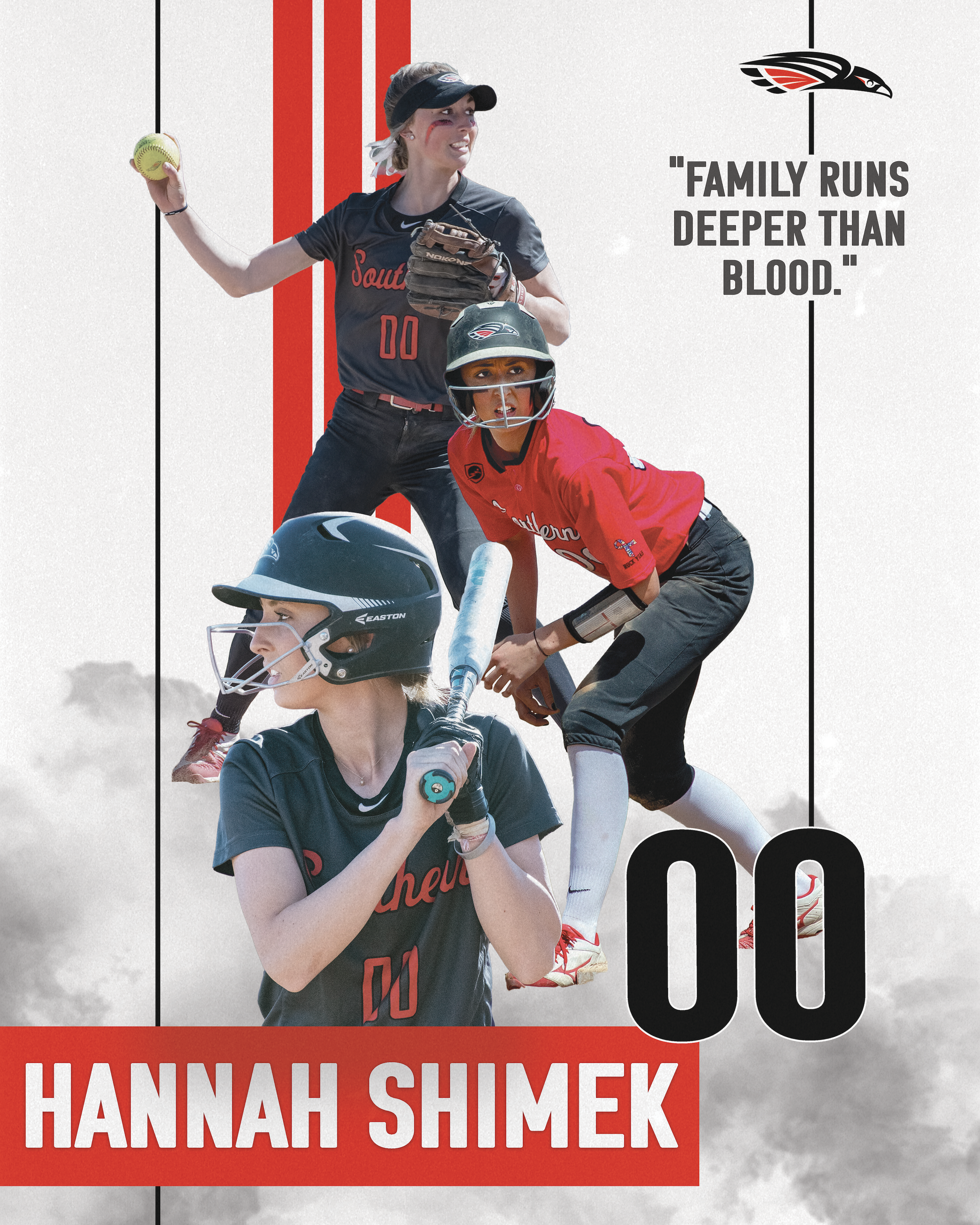
SOU Softball Senior Posters 2023
Adobe Photoshop & Illustrator
-
Laying Foundation
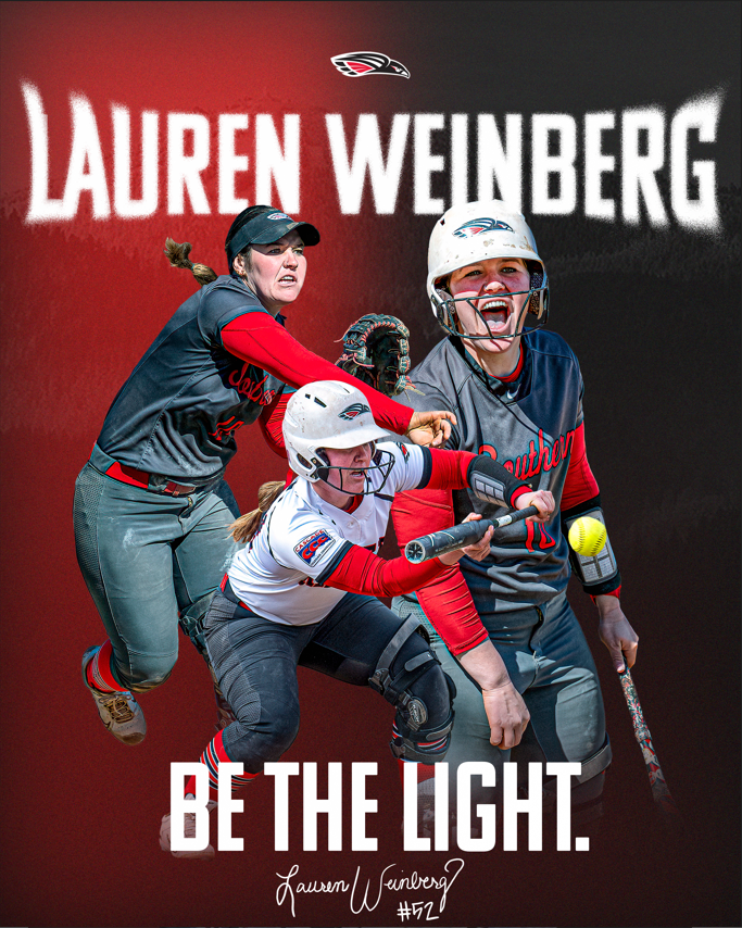
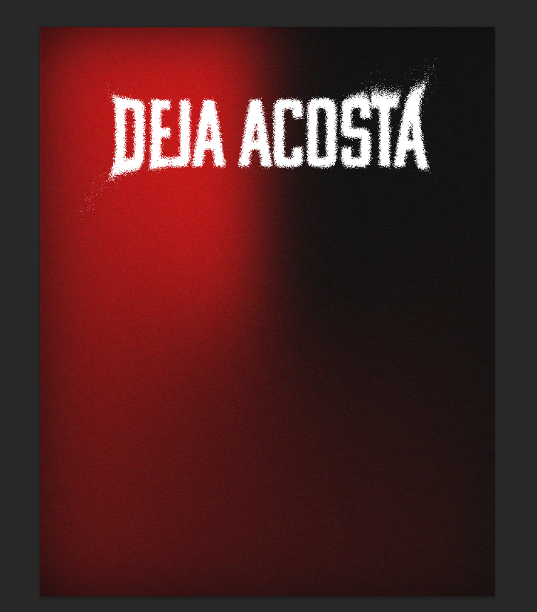
In years past, I have generally kept a bright and “cleaner” look to the SOU softball posters. This year, I wanted to take a different approach. I added a grain to my custom gradient. I used black, white, and red for the University’s colors. I wanted the typography to be cohesive with the background. I dissolved the text to include a grainy effect and manipulated the text to feel as though it was blowing away.
-
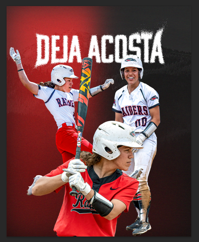
Photo Layout
Each photo was carefully cut out from shots throughout the season and selected for layering. I added a photo of Mt. Ashland into the grainy gradient background for a subtle nod to the beautiful landscape and valley where SOU is located.
-

Blending, Photo Enhancement, & Signature
I faded out edges of each photo so that they would seamlessly blend with the other photos and the background. I added the SOU Raider logo and found my placement for the athlete’s quote and signature.
-

Final Print
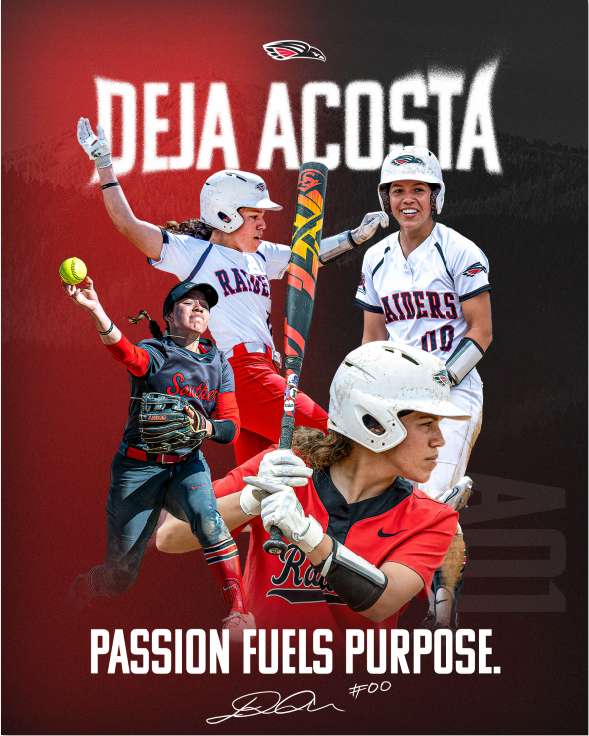
My final product includes the athlete’s signature and quote in its final form. I added an additional photo to showcase more offense and slightly rearranged the photos for a better composition. A last minute request was made to add “Ao1”, which means All over One. I added this in the first photos’ “line of sight” to represent her focus towards that mantra and lowered the opacity to not disrupt from the composition. Almost as if the mantra lives in the back of her mind.
Feel free to take a look at more posters from this season’s seniors below.
Rogue Kicks Sneaker Seller
Adobe Illustrator


Rogue Kicking
Adobe Illustrator


SOU Softball Senior Poster
Adobe Photoshop
-

Laying Foundation
To begin the graphic, I wanted to create a base of shapes that I could work around to coincide with the dynamic photos that would be added later. I used the university’s colors and ensured that every shape was similar in degree but random in spacing.
-

Photo Layout
Each photo was carefully cut out from shots throughout the season and selected for layering into the shapes. After I was happy with the spacing and layering, I added shadow underneath each pose to create the illusion that the player was on the shapes.
-

Typography
All important information was put in black with white/gray shadow to push the hierarchy in the design. The quote was sized down and made with a red shadow so that it wasn’t lost in the photo below.
-

Final Print
The final print was presented to the senior on their last home game at SOU. The graphic was printed on a 16x20 metal canvas. Look at the gallery below to see the final print file!
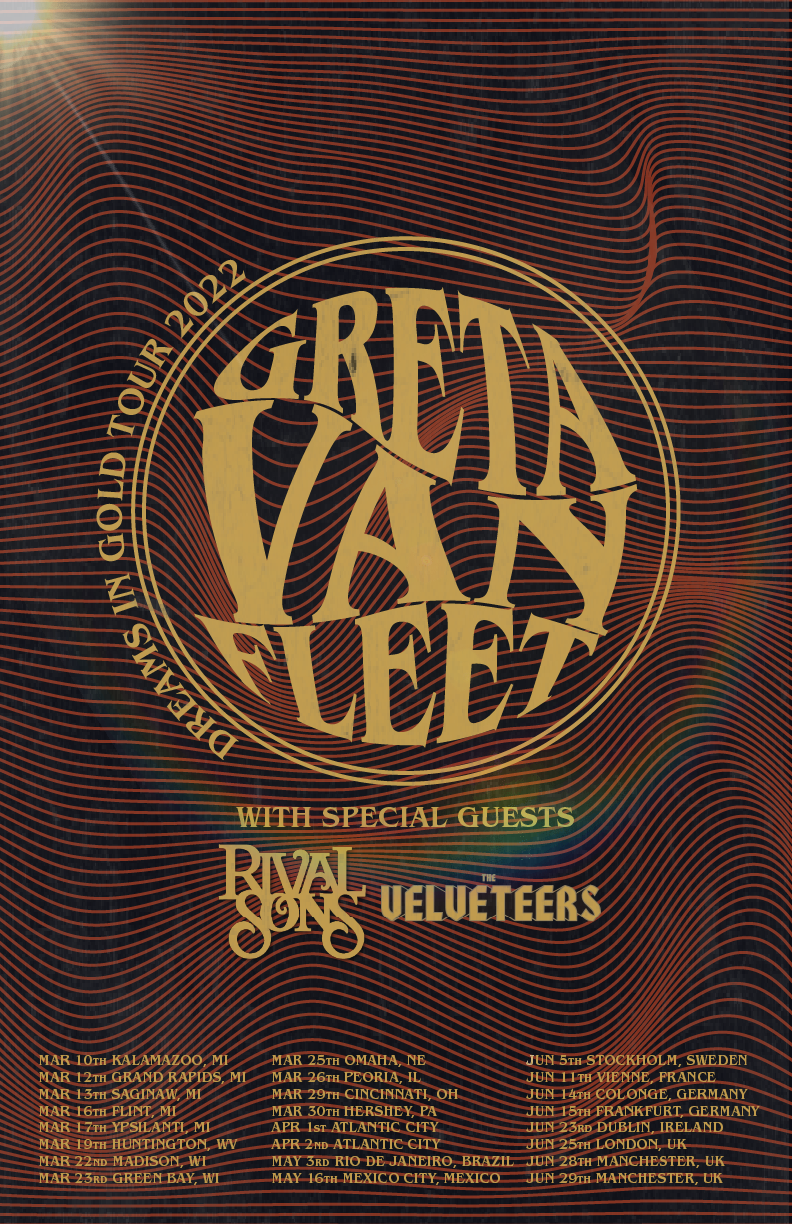
Greta Van Fleet Band Poster Process
Adobe Illustrator
-

Moodboard and Brainstorm
This design started with drawing previous graphics to conceptualize a typography poster for the band. I drew colors that I found gave a 70’s vintage feel from the album art. Lines were also a consistent pattern throughout all the designs and I wanted to keep line details in mind during the design.
-

Structure and Background
With incorporating line patterns in the designs, I found that adding movement within a typography poster would be very important. The wavy line provides visual interest and texture to the poster.
-

Adding Typography
To contrast the lines, I chose a bubbled letter with the band’s signature font with a circular border to contain the title. Secondary information was smaller in font size, however, still the same color to not compete with the busy background lines.
-
Final Poster
Light and a film overlay was added to compliment the 70’s feel. The final poster can be seen larger below.

SOU Softball Senior Poster - Cayla Williams
SOU Softball Senior Poster - Deja Acosta
SOU Softball Senior Poster - Lauren Weinberg
Greta Van Fleet Concert Poster -Typography
SOU Softball Senior Poster Design 2022
Kicking and Punting Lesson Business
SOU Softball Senior Poster Design 2021

Gatorade Logo Redesign
Buying and Selling Sneaker Outlet
Buying and Selling Sneaker Outlet
Greta Van Fleet Concert Poster -Typography
Kicking and Punting Lesson Business

Mock Podcast Cover Art
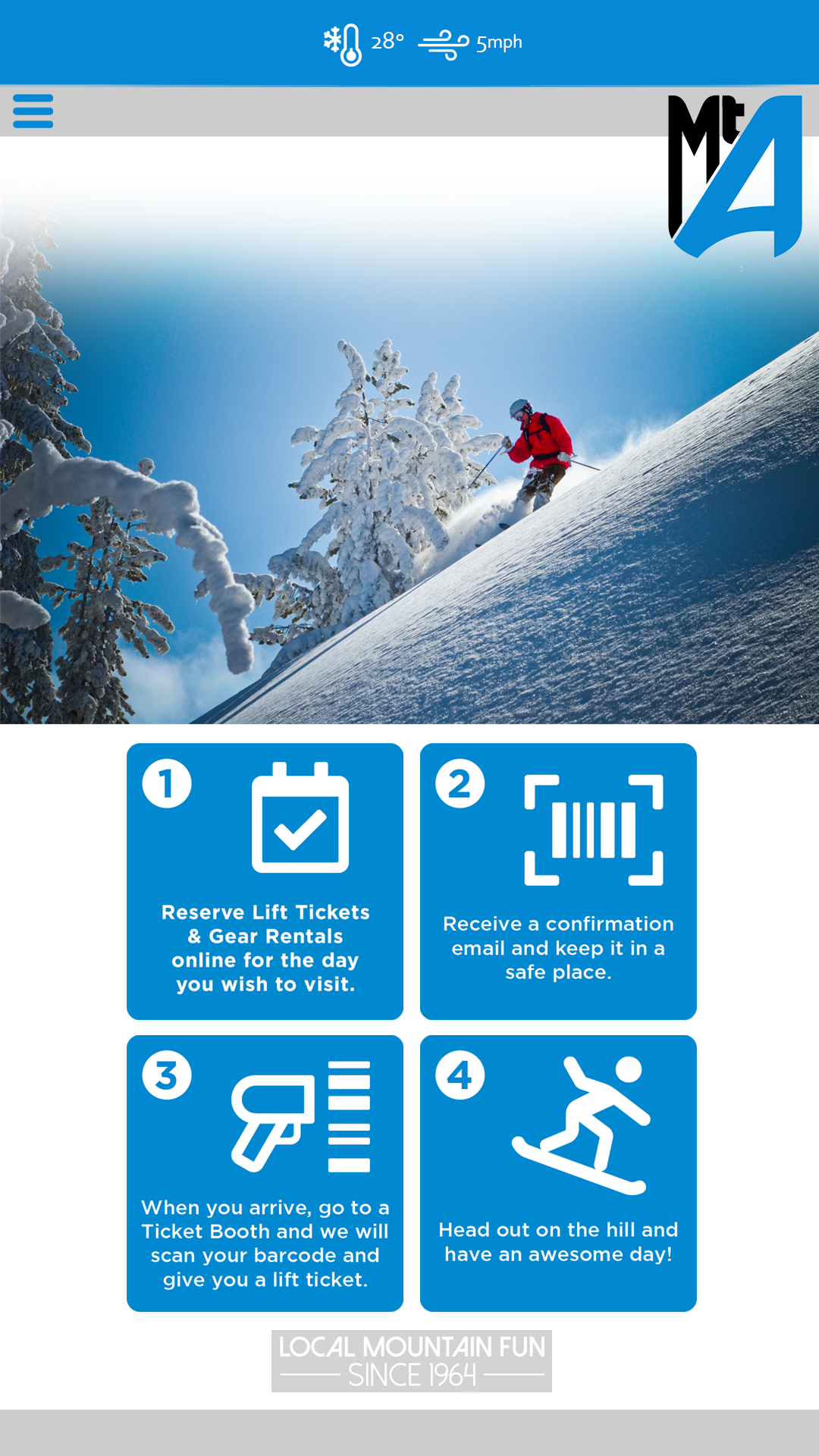
App Design for Mt. Ashland Ski Resort

Save The Date Design